Membership Dashboard
Create visual representations of your Membership data. View graphs:
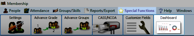
Access Membership Dashboard
To access from the Button Bar, go to Special Functions > Dashboard.
Dashboard Display Controls
Across the top of the dashboard are several toggle switches that turn display for a graph on or off. Any toggles that don't fit can be accessed by clicking the down arrow at the end of the row.
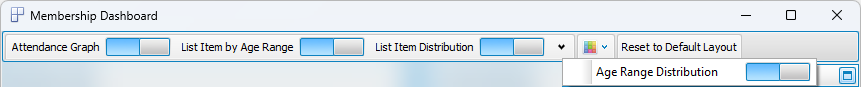
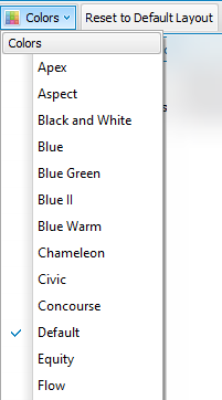
With the Colors menu, select a color scheme to apply to graphs.
Use Reset to Default Layout to return the dashboard to its original setup.
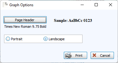
Click Print to view a Print Preview and send the selected graph to your printer. Control fonts and page orientations from the Graph Options window. You can also create Exports for graphs or Send via Email from the Print Preview window.
Graphs
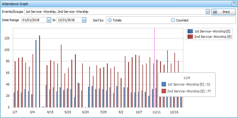
Attendance Graph
This graph allows you to compare the attendance of your Manage Events and/or Groups & Classes. Depending on how you Enter Attendance, you may want to see the Totals, based on recorded attendance for individuals or Counted, based on headcount. Select the Event(s) from the dropdown at the top and enter a date range.
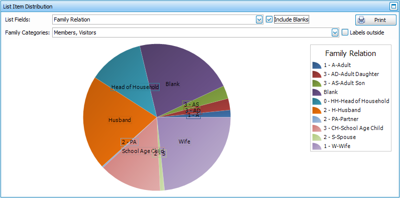
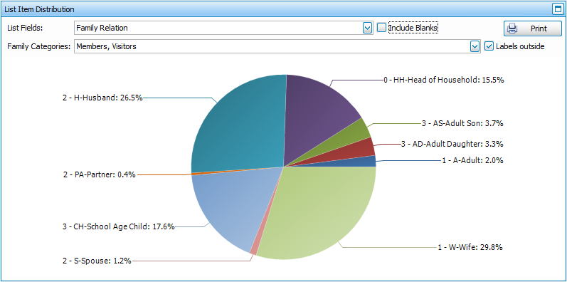
List Item Distribution
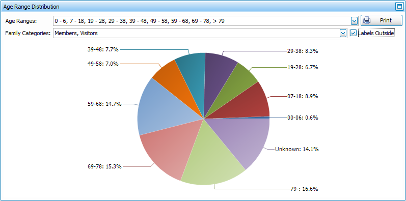
This pie graph shows you how many people in your database are assigned each designation in a List field. This graph can help you determine the appropriate way to Manage Codes. You can choose to view all or selected Family Categories. The Labels Outside option lets you decide whether you want to show the graph with accounts and totals in a key or whether to show display those around the graph with percentages.
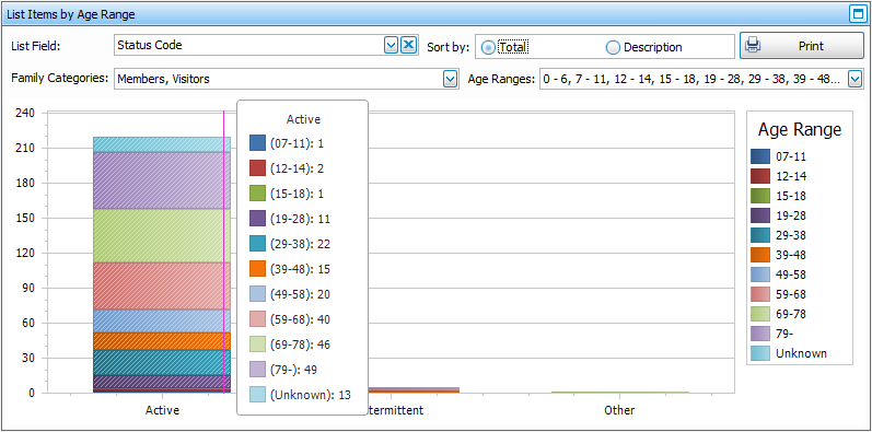
List Items by Age Range
This graph will show a breakdown of each assigned List field code by the Age Ranges you define. You can view these breakdowns within selected Family Categories, if desired.
Age Range Distribution
This graph will show the distribution of ages within your organization. This information is based on the dates entered into the Birth Date field, so those without this data or with a '????' placeholder will not be included.